
Downtown LA’s Jewish Home
דער נסתר
Der Nister
Synagogue & Cultural Center
Latest Newsletter Columns


About Us
Der Nister Downtown Jewish Center is a synagogue and cultural center on the 14th floor of the century-old Spring Tower Lofts, formerly the Barclay Bank Building, on Spring St. between 6th and 7th in Downtown LA.
Der Nister is a space for you to feel at home with your full Jewish self. We hold religious services and host plays, concerts, readings, gatherings and more for the Downtown and Greater Los Angeles community.
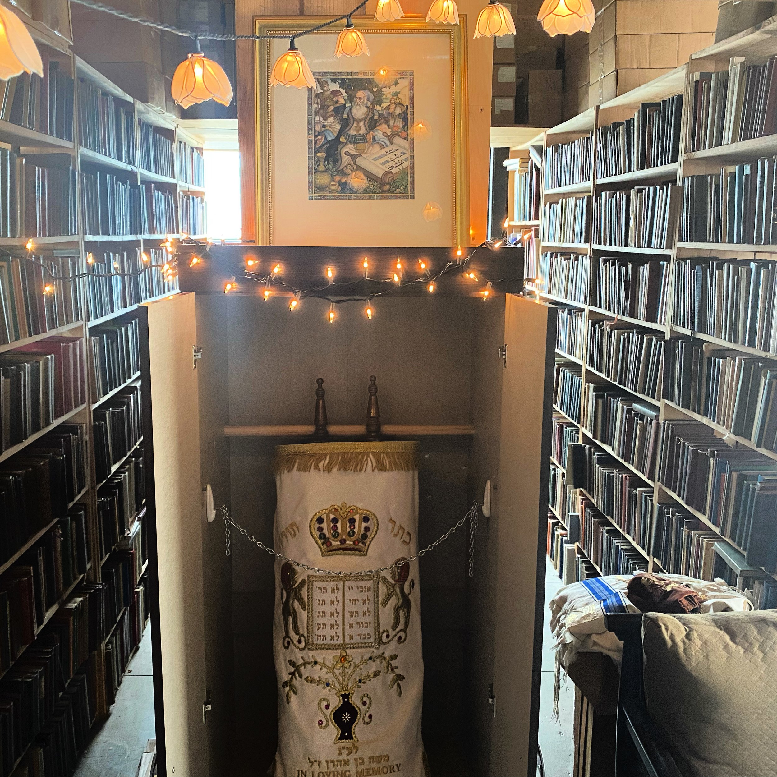
Der Nister (Yiddish: The Hidden) is the brainchild of Rabbi Henry Hollander, a Jewish bookseller, and Rabbi Zach Golden, a former Deputy Editor of the Yiddish publication the Forverts, a core team which was later joined by Rabbi Ye'ela Rosenfeld. Located in Rabbi Hollander's antiquarian bookstore, those who come will be surrounded by treasures of Jewish civilization - Jewish books that span the centuries, and beautiful views of the skyline, deep learning and musical prayer.
Read more about us in recently published articles.

Support our mission to build Jewish community in Downtown LA through your tax-deductible donation through our fiscal sponsor Yiddish Arts and Academics Association of North America (YAAANA).
Donate
Synagogue
We hold weekly services on Saturday morning, followed by Kiddush. Rabbi Henry Hollander gives the D’var Torah, and Rabbi Zach Golden leads the prayers. We also host Kabbalat Shabbat, the High Holidays, and other holiday services, as well as a Monday Torah study at Disney Hall.
The services are traditional and egalitarian, filled with song and chant, and are set in the beautiful synagogue space. We have a Torah, generously on loan from Cary Pollack.
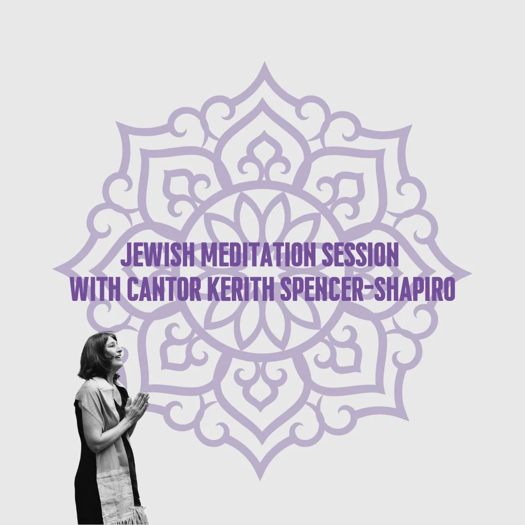
In our newsletter, you will find our thoughts weekly on the parshah and other matters of Jewish interest from a wide variety of contributors.

Community Space
Der Nister is open for visits and “Ask a Rabbi,” discussions and quiet study. (Or browsing the books!) Come by appointment, or during an event or service. Enjoy the space, or relax on the building’s roof, where we host our communal barbeques.

Cultural Center
We work with community partners to stage plays, concerts, poetry readings, movie screenings and more in our unique environment. Der Nister is home for thoughtful Jewish living.

The Der Nister experience
Spring St., an historic and chaotic thoroughfare in the heart of Downtown, is the introduction visitors have to Der Nister, a recently lit candle in the guttering lamp of Los Angeles Jewish life that prospered in Downtown a century ago; Spring Street is the melting pot of the well-heeled and the downtrodden; it is a place of great hopes of urban renewal and of precariousness. If Spring St. lives up to its potential, it will become a model for an LA that can harmonize its past and future, its poor and rich, and exist within the public transportation system in its fullest glory. The experience of Der Nister starts on the street. Spring Street isn't always for the faint of heart. Injustices and degradations that are hidden from them the view of most Angelenos, save from the comforts of their automotive sanctuaries, sets the first time visitor up for an experience they cannot be prepared for.
The visceral experience of the street leads into an old building, an elevator with half-faded tableau of an Art Deco past, and a spartan hallway on the 14th floor (secretly the 13th), a premonition of the hidden world visitors are about to enter into.
And when they reach the end of the hall, they find themselves in a room far larger than they would have expected; even more oddly, it is lit in gold. Bookcases packed with Jewish books written in many languages and from many eras tower towards the ceilings high above. Cookbooks and volumes of Medieval Islamic philosophy stand side by side. Kabbalistic books huddle together with anarchistic manifestos in Yiddish, as though they were written in the same town at the same time. (Which in fact, they may well have been.)
Suddenly it becomes clear to them that Jewishness is neither a culture nor a religion; it is a borderless way of life. They are conflicted. This way of being isn't like anything they have seen in America. It is an affront to everything that they’ve encountered; but the sweetness of it overwhelms their anxieties. Walking among the books, or watching a play about Karl Marx in the same space where Shabbat services take place, sung with the traditional melodies of a century ago, reveals the same Jewish spirit.
It is here then that shock, the wonder, the confusion and the education begin to transition into something more important: a community of people, not at all like-minded except in that they have permission within themselves to pursue their Jewish reality and creativity, spirituality and religiosity, bound together by proximity and speaking from the heart.
Downtown has a hidden place, but it is hidden not out of volition but out of necessity. It is a place of revelation. The Jewish paradigm of a continued thread of civilization from America and Europe of a century ago, before disaster, requires nurturing and peace. It requires faith and patience. It requires love for the beauty that lies inside each person who comes to cultivate their Jewish self.
Der Nister was a Yiddish writer, who lived in the Soviet Union and Weimar Germany but wrote in the style and substance of the Breslov Hasidim. His pen name means “The Hidden,” and it is from that we have named ourselves. It hints that there is something divine in hidden places, and those places are physical, places where the geography of the world and of the body meet, and where the spark waiting within the Jewish people can emerge and thrive.
The Story of Our Logo
Der Nister - דער נסתר Yiddish for "the Hidden" - from the Hebrew "HaNistar, הנִסתָר," was meant to be evocative of a spiritual truth: that what is divine is hidden. The synagogue is hidden on the 14th floor (really, 13th floor) of a Spring St. building, filled with centuries of books and life waiting to emerge - as is the soul within us waiting for a moment to be revealed. The mystery itself is truth, that holiness awaits those who carefully delve into the self, into our heritage, and into our city, to find that respite of healing and joy away from the noise of our lives.
The idea within Torah itself that stood out to us to be a defining seal of this truth are the verses:
וַיְהִי בִּנְסֹעַ הָאָרֹן וַיֹּאמֶר מֹשֶׁה קוּמָה יְהוָה וְיָפֻצוּ אֹיְבֶיךָ וְיָנֻסוּ מְשַׂנְאֶיךָ מִפָּנֶיךָ׃
וּבְנֻחֹה יֹאמַר שׁוּבָה יְהוָה רִבְבוֹת אַלְפֵי יִשְׂרָאֵל׃
"When the Ark would set out, Moses would say, "Arise O God, scatter your enemies and make your foes flee before You!" And when the Ark stopped, he would say "return back O God, the Myriad of the Thousands of Israel."
(Numbers 10:35-36)
God dwells within and is asked to emerge - and then God comes back within. These verses are used in the prayers as the Torah goes out and then comes back within the Ark - just as God did. It speaks to a paradox about the delicateness and power of divinity. How could God be both? Why is Torah both?
Torah is very delicate. One letter smudged on its parchment makes it unsuitable for religious use. It is also powerful. We pray for healing before it, knowing that it carries our prayers high. Spirituality is very delicate as such. We struggle to hold onto it, to keep it, when it is not valued, and when it is so hard to listen to the small, still voice within us. Yet it is powerful, guiding our lives and giving us purpose should we be so careful to calibrate ourselves to listen to it. This is what God is in our experience. Hard to hold onto, the ultimate when we do.
To add to the mystery encoded with the verse, there's a mystery surrounding the verse.
There are two ׆ surrounding these two verses. As far as we know, these are markings and not letters. Some suggest they are scribal markings - but there is the opinion that these two verses constitute a book of Torah entirely to themselves.
In this reading, these backwards nuns (׆) surround verses about the hiddenness and power of God and Torah, shrouding the verses with an additional mystery, but suggesting that there is a Torah within the Torah. This Torah within a Torah serves to emphasize the Torah within ourselves, the God within everyone and everything.
To us, the idea of Der Nister, which both means The Hidden but is also a name for God, was best encapsulated by the nun (נ) of Nister נִסתָר, and the ׆ of the verses. An ideal logo, we thought, would be to put them together, perhaps in a pomegranate - which represents a hidden Torah as well, for it has 613 seeds according to the Talmud - the number of commandments in the Torah, contained within.
We reached out to our friend Nava Brenshtin, a co-founder of a Jewish community in Ein Kerem, near Jerusalem. She had been practicing Hebrew calligraphy, and we asked her to construct such a logo for us. She generously agreed - and offered us several variations. What she did very much impressed us.
We can see from the image that the crowns of the nuns that are traditionally placed there extended into the crown of the pomegranate itself. We thought that it was a very tidy image expressing these ideas that we thought were inherent in Der Nister.
This image will live on in the Der Nister iconography as an image of the traditional merging with the creative as indicative of the mystery inherent in the name.
However, soon after this image came out, we received a generous offer to create a logo based on this from a Turkish designer named Haluk Aydın, of the Istanbul-based Marangon Creative Agency. We were introduced to him through our dear friend Kerem Siral, who had been briefing Haluk on this project for quite some time.
We struck it off. Haluk is a very thoughtful person along with being a capable designer. He understood that what we were really asking for was not just a revival of traditional religion, but rather something that would take religion itself into modernity, into the world where others could enjoy it, stripped of closed-mindedness.
He took these aspects into consideration as he walked me through the design process. First, he started with the nun idea, but he simplified the calligraphy. When we asked him why he did this, he said he did not view it as purely modern thing. It was similar move to what he and others had done with modern Arabic calligraphy - using straight lines, and he said, it's not a function of modernity itself. The straight lines in Arabic calligraphy were based on Kufic script, which dates back to the 7th century.
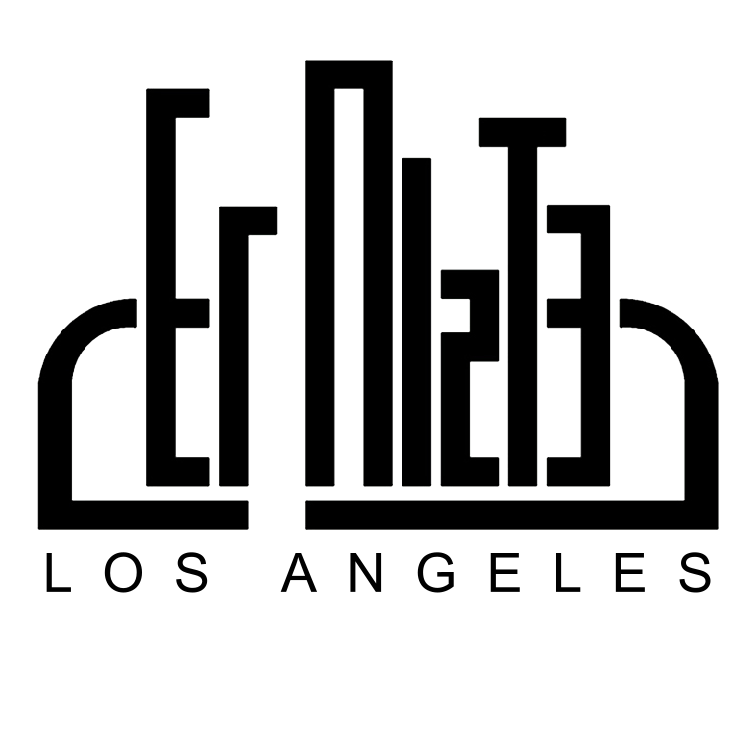
With the nuns flanking both sides, Haluk the added the Downtown cityscape in the middle as the central design feature. This signified the urban, modern quality of Der Nister, placed squarely in Downtown Los Angeles. It was important, in retrospect, to have the city be such a key part of the design. After all, our real claim to fame may be to service the religious needs of a unique, beautiful, and relatively under-served part of Los Angeles, with all of its majesty and edginess. Indeed, Downtown Los Angeles' revival served as a parable to us of the general idea - that this place where Los Angeles is most desegregated, more cultural, most free, least car-bound, most modern, and most historic, is hidden in plain sight. Hidden, except to the seekers who look for a better Los Angeles.
But the cityscape was not bound to stay as silhouettes. Instead, it was transformed into the words Der Nister, using the modern simplicity of the nuns - as described above - but in an Art Deco form, reminiscent of the lettering of Downtown Los Angeles' architectural masterpiece of the early 20th century, Union Station. Indeed, an additional harmony formed through this, because the stark modernity of image was also a throwback to the styles of pre-war Europe, which harmonized with our mission of reviving and taking pride in our past and in Yiddish, and bringing it into the future.
The cityscape of Downtown LA, with the name Der Nister in its English wording, combined into one form, with lettering in the revived style of the 1920's.
All together, the past, present, and future of the city, the religion, and its spiritual hiddenness, combined in the logo you now see before you. For that, we must extend our gratitude to this articulation of this vision to Nava, Haluk and Marangon Creative Agency.


The Pomegranate Calligraphy
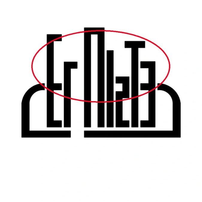
The nuns, simplified and flanking the name, standing in for the D and R of Der Nister
The cityscape of Downtown LA, with the name Der Nister in its English wording, combined into one form, with lettering in the revived style of the 1920's.